Johannes Erler | Mirko Borsche | Lars Harmsen | Mario Lombardo – Designers' Battle
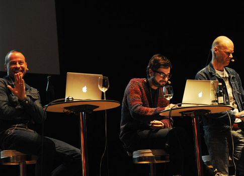
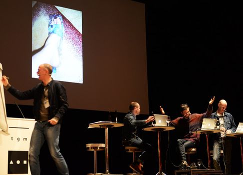
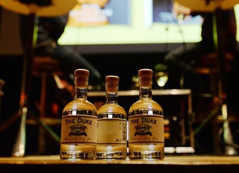
»The most important utensil we have to have on stage is a crate of beer« says Boris Kochan when listing what things are needed for the Designers' Battle. Plus a flipchart and a few pens. A bar stool, opened laptops and bar tables are already up there. With Johannes Erler presenting, also appearing on stage will be Mirko Borsche, founder of editorials like »jetzt« and »Neon«; Mario Lombardo, designer of magazines like »spex«; and Lars Harmsen, publisher of »slanted«. All three will be battling it out with one another. There are rules of course. For the sheer hell of local patriotism, the catchword today is lovingly »Munich«. He who gives appropriate answers wins points. And the winner can look forward to a large bottle of gin from Munich as the top prize, while the second prize is three small bottles and two mini bottles of gin will be going as third prize. »That’s mine« Erler says popping a bottle into his jeans pocket.
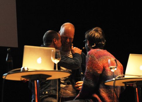
»Monumental« as the first catchword of the day fits in perfectly with what follows: the individual pictures from the three designers’ presentations follow one another in high-paced alternation accompanied by loud music and hammering beats. In the midst of all this, the three photograph one another and together – huge group selfies with three simultaneous cameras and the presenter on the open stage, having fun with one another, we are family. A group hug, then back on to the bar stools and the bass tones herald the start of the battle. The diverse works of Mario Lombardo and Mirko Borsche flick across the screen. »I can’t do what they’re doing there!« Lars Harmsen says, his tongue firmly in cheek, and presents the results of his first job as a graphic designer. »Since then, I know everything there is to know about … wrestling.«
From wrestling to Beavis and Butthead, the upbeat tour takes us on to New York, where the Hyatt is looking for a very Bavarian t-shirt. Designed by Mirko Borsche – with braces from a traditional Bavarian costume printed on it. Harmsen takes command of the presentation, moves on to three black-and-white stripes and his book about Adidas with more than 100 interviews with people who have a close bond to the brand with the three stripes. A stop along the way with girls and a parrot and then Lars Harmsen continues. »Clash of Cultures«, a fitting motto for the yearbook of the ADC/Art Directors' Club. Hand on heart – so much self-irony after years of happily celebrated bickering among the creative? Who would have thought? After various attempts to get started, which were just as exciting as the squabbling among the creative ones, a book finally emerged, a »book with holes and the salad shining through.« Multicoloured stripes in the perforated look, a bit retro and 1970s, don’t you think? Harmsen just shrugs his shoulders. New catchword please.
And the scores at half-time: a three-way draw with 29 points each. The entertaining neck-and-neck race continues with milestones from designers’ lives: Lars Harmsen’s America pictures lovingly distorted using analogue means, chemicals and a cigarette lighter not only adorn the cover of a Joy Fleming record, but also a CD by Jule Neigel and, Tusch! - by PUR.
»After that I stopped working for the music industry.« Understandable. Somehow.
And despite some disasters along the way, all three gentlemen managed to make something of themselves.
www.stern.de
www.mirkoborsche.com
www.magmabranddesign.de
www.mariolombardo.com