Stefan Kiefer – In a red outline
Born on the island of Sylt, and having grown up in North Frisia, Stefan Kiefer testifies himself to having the inflexibility, a certain stubbornness and inertia that Northern Germans are known for. Suitable character traits for a graphic designer and art director at SPIEGEL magazine: »You have to be able to put up with stuff in a job like that« Kiefer remarks laconically. »... but it is still a great place to work«. In the meantime, Stefan Kiefer is no longer responsible for the front pages, but designs the SPIEGEL monthly magazine. Common factor shared by the monthly and weekly magazine – the front page motif is crucial.
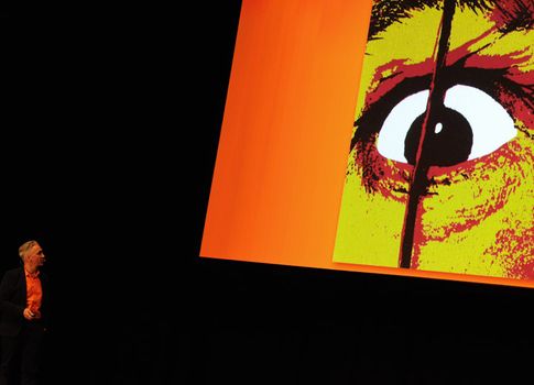
Kiefer takes his audience on an interesting journey through time and through an extensive collection of SPIEGEL covers, in order to at the same time illustrate with a light touch to what extent the individual front covers within the SPIEGEL’s red outline remain in the mind: whether Dali, Willi Brandt kneeling down, the debate surrounding paragraph 218 or the Mafia – when shown a small cutout of the front page image as a kind of puzzle – the audience is able to guess the right full-page motif almost every single time. The magazine already demonstrated design extravagance early on »with in-your-face images« (Kiefer); with illustrated, put together and photographed title images that occasionally have parts that fall outside of the red outline. »I had to walk in the great footsteps of those before me...« - says Stefan Kiefer of 1996, the year he began working for SPIEGEL.
His very own front pages like the photo of Laetitia Casta as Europa on an illustrated bull (»that cost a fortune!«), the illustration on the Reemtsma kidnapping, a reconstructed puppet theatre, caricatures and drawings – the wide range of weekly front pages is as diverse as it is entertaining and its effectiveness unfolds above all due to the fact that front pages from over such a long time span are presented in such density, one after the other. What usually lies at the local kiosk or newspaper stand a week apart comes at the audience rapidly a second at a time becoming ever more impressive in the process. Some of the motifs are references back to well-known motifs, reproductions and new interpretations of visual icons from Magritte to Chaplin, whose cogwheel motif from »Modern Times« was reconstructed completely on a computer as a clockwork mechanism populated by contemporary figures for one of the red-framed covers
»When we pick up on something, then directly and with force« is Stefan Kiefer’s brief comment about one SPIEGEL cover page dealing with the Catholic Church’s dilemma with sexuality and celibacy. It could also apply to a great many other front covers: succinct, provocative, forcefully to the point – from the financial crisis to political disasters, from the Grand Coalition to climate change. Sometimes with tongue in cheek, often ironic, sometimes painfully clear. What is designed to grab the potential reader’s attention as he or she passes by the newspaper kiosk should (and is allowed to) hurt.
www.spiegel.de