STERN – daring to relaunch
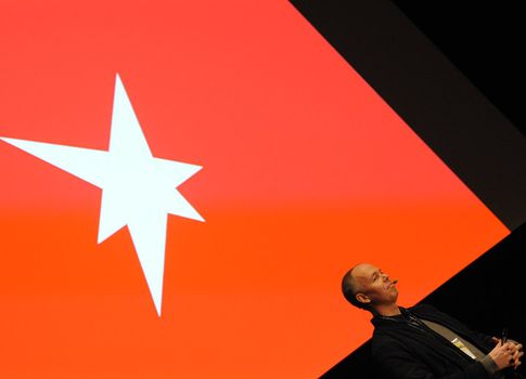
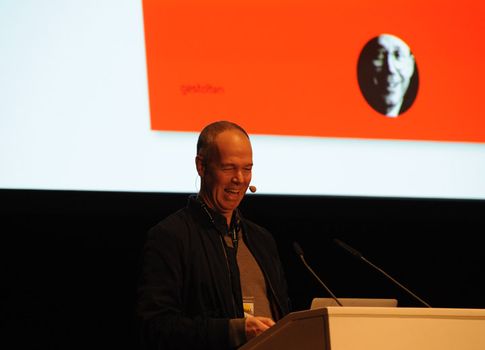
791 days to the day. Designer Johannes Erler has counted the days since he started as Art Director at STERN magazine. His office ErlerSkibbeTönsmann counts a great many illustrious names among its clients: the Süddeutsche daily newspaper, whose relaunch was designed completely by them including the type design; various publishing houses, as well as theatres in Bremen, Dresden and Stuttgart. Since 2012, as Art Director of STERN, it is he who has dictated the magazine’s outward appearance and he was in charge of its relaunch.
Day 1. Shaky knees. Day 123. North wind. Erler names particularly meaningful days, and number 123 is one of them – it marks a beginning: the relaunch begins as an idea, with a great deal of searching through archives and a lot of basic research. How can you bring a brand with a long past into the present? Where does STERN stand in the public consciousness? How do you build bridges and how do you translate that into a contemporary outward appearance with contemporary contents? Day 219 brings a fresh breath of air into his mind: a visit to New York to gain experience at a large publishing house there. Day 284, code name Caruso. Great changes are ahead, an extensive restructuring of the editorial office as well as a new editorial organogram are on the cards. Restructuring and motivation are crucial elements in the relaunch. What an editorial doesn’t represent or go along with will not succeed.
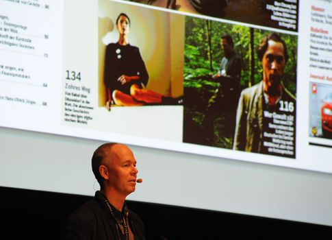
What seems at first glance to be a sparing renewal is actually quite complex when you take a closer look. A number of new sections in a new structure, a return to large-format picture series and with that a completely new type design adapted especially for STERN.
Erler is 49 and he practically grew up with STERN. As such, his own experiences with the magazine are his guide. A look back and in some respects a return, without coming across as old is his goal. Day 351 – the restructuring also starts online. And things really get going on Day 388: »It became clear that it was going to happen now. I was really tired when that day ended« says Erler.
In the weeks following the first issue of the relaunch, the magazine is subject to further changes. The font types on the cover are pushed to the foreground and change from issue to issue in their fine details. The editorial office tries stuff out, experiments with eye-catchers and the amount of these to be accommodated on one front page. The relaunch is a »work in progress« as it were. Day 723. The best has been kept to last: front page, inside, double-paged photo pages, typographies and contents – the design of the last issue of the year is something that Johannes Erler is really happy with. »Reduced to a minimum, like with the Snowden story, no headline, it was great fun to do.«
Day 791. The present. The current issue of STERN is at the kiosks. Perspectives for Johannes Erler? A great deal: calm stories with reserved typography, topical political reports with impressive photos. The first insight into the planned fashion supplement with pictures by the Leipzig painter Rosa Leu gives us a hint: and that’s not all. There is more to come, print is a long way from being dead, »it’s still possible to make great magazines.«